Creating distance in landscape painting
These are notes on creating distance in landscape painting from a recent workshop that I taught. I have left them unedited including the practice warm-up instruction. I hope that you may find them useful:-
"The main problem we encounter when painting and drawing is that we are attempting to create a 3D image on a 2D surface. There are several ways we can try to overcome this, using the elements and principles of design.
The first element we are going to consider is colour. It is very easy to confuse colour with tone. I often use the same colours throughout a painting, but by adding white, grey or black to it, the tone can be very different. We use the word tone very broadly to take us from our lightest lights to our darkest darks with many changes in between. However, to be technical, tone is really the addition of grey to your colour. Adding white creates a tint and adding black creates a shade. As we know, some colours recede, whilst others appear closer. Imagine sitting at the back of a church and the pedestal at the front is of blue and yellow flowers. The yellow flowers will appear closer, whilst the blue will almost disappear. We can use a combination of receding colours and lighter tones to make our horizon seem further away.
Most of my landscapes are painted using only three primary colours and white. If you are working in watercolour, the white will of course be the white of your paper. To lighten tones in oil and acrylic we add white to the mix, whereas in watercolour you add more water to make them more transparent and allow the paper to show through. It doesn’t matter what medium you are working in, the elements and principles are the same.
In general, when we look at the horizon, the tones are lighter and the colour is less vibrant. However, there are always exceptions to the rule. Perhaps it is overcast in the foreground and the sun is shining on a field of yellow sunflowers at the horizon, that is when we need to use other elements and principles to emphasise the distance.
Before we go on to the drawing and talking about scale, perspective, repetition etc. We will do a quick warm-up exercise with three primary colours and white.
Do this on a practice sheet and mark out a long thin rectangle, like a bookmark shape. Choose any three primaries you have and stick to those three (try some you wouldn’t usually use together). Mix a good quantity of grey from your three colours only, and test it on paper to see what it looks like, it should be grey not brown. Now take some of that paint (saving the rest for later) and add a generous amount of white to it (or water if using watercolour). Paint a strip across the top of your rectangle. Now add a tiny bit of your original grey to this light mix and paint another thin strip underneath, repeat this a few times, gradually increasing the tone. Try to do this very gradually with lots of thin strips of colour increasing in tone into the foreground. When you do your landscape, the principle will be the same even if your colours are different.
Before we begin our drawing, we need to think about our composition. Don’t just copy the photograph as it is. Think about what it was about the image that attracted you to it and about how you might want to focus on that. Some parts of the photograph may be boring and you might want to leave them out altogether. You may want to move things around, chop down trees, or move a wall. Do you want your painting to be oblong or square, portrait or landscape? You may want to draw some thumbnails to explore your ideas.
The second element of design to consider is space. There may be several miles between the viewer and the horizon in your painting. Let your painting breathe, don’t feel that you need to fill every corner of the paper with detail, and give the viewer's eyes rest in the midground. Your aim is to keep the viewer within your painting for longer, don’t rush them with unnecessary clutter.
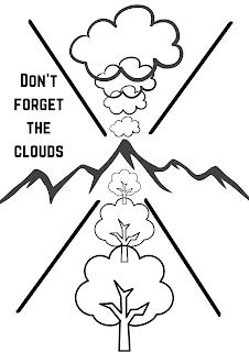
We can’t talk about distance, without considering perspective. We very often use rivers, roads, walls and paths getting smaller into the distance and towards a focal point. But, we often forget to apply the same principle to our skies. Clouds too are smaller in the distance and follow lines of perspective. As no one looking at your painting later will know how the clouds were on that day, you can invent clouds and move them around to create both distance and line. Think about where the weather is coming from, you may want to alter it. I don’t draw my clouds, but I do draw a few directional lines.
Scale is quite an obvious element of design and our eyes will pick up when things are out of scale, such as a hedgehog being bigger than a cow. But it can also be over-emphasised and used to create a more dramatic distance. You can put a fence post, rock, flower, grass etc. right at the front of the painting on a large scale to create space and make the viewer feel that they have to look past it. You can also add people or animals in the distance with very little detail. If a person was standing a distance away, you couldn’t see the detail, so don’t draw it. Unfortunately, cameras pick up more detail than the eye, so imagine yourself there and don’t recreate what’s in the photograph.
Repetition can also help create distance. Think about a line of trees, houses or fence posts, they create movement and enhance perspective too.
I use line in my work to create rhythm and direct the viewer around the painting. These lines can be imaginary or altered to enhance your composition.
We will start by deciding on our composition and doing the drawing and come back and talk about the painting before we continue. The drawing is of equal, if not of more importance than the painting, so take your time with it.
I will do my drawing using a neutral colour, don’t use either black or white as these are the most likely to show through. If using watercolour, use a light pencil line.
Once you are completely happy with your drawing, we can start our painting.
I usually start by looking at the colours in the sky, I choose my three primary colours depending on the greys and blues in the sky and clouds. I then use these colours throughout the rest of the painting. That way, you don’t need to worry about achieving harmony in your painting. If I have leftover grey and blue from the sky, I use it to start an underpainting of the foreground or for shadows. You can add more colours if you like, this is just how I like to work with limited colours.
We will do the sky and come back and talk about the background whilst that’s starting to dry.
Depending on your subject, you may have distant hills, fields or the sea. Sometimes it is difficult to see where the sky stops and the sea starts as they are so similar in tone. Carefully observe the horizon, looking at both colour and tone. Remember to use scale. Waves and hills are closer together in the distance, and thin horizontal lines work well for this.
Continue down your paper, moving towards the foreground. As you reach the foreground increase your level of detail and the intensity of colours. Don’t forget about your shadows too.
The highlights should be limited and not too fussy. You can use highlights to draw attention to your focal point. I find that an off-white such as cream can be more effective than brilliant white."


.png)
Comments
Post a Comment