Posts

Showing posts from 2017

Creating Artworks for Christmas cards

Image
This was the handout from a workshop I ran recently on Christmas cards. I thought some of you may find it useful :-  Christmas Card Designs in Watercolour Christmas is a great time of year to be more adventurous with your artworks and use your imagination. It is good to get away from relying too much on reference photos and think about creating your own compositions and designs. We all know that Reindeer can't fly, so reference photos of flying reindeer may be hard to come by! We therefore need to gather reference photos and ideas from varies sources to bring together for our chosen themes. It's a good idea to start by looking in the shops to see what is in fashion for the year. If you have the time, it is nice to make “one off” cards on watercolour paper for those closest to you. You can buy watercolour blank greetings cards. However you may find it more cost effective to make your own. Using a ruler and scissors or a guillotine, cut your paper to the size o
Capturing movement in your artworks with mixed media.

Image
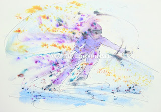
These notes were from a handout of a workshop/demonstration I gave at a local art group.  I thought they may be of use to beginners who would like to "free up" their drawing and painting. Capturing movement in your artworks. Drawing a still life and observational drawing is essential to build skill and confidence. However, I often hear people saying that they would love to “free up” their drawings and paintings and be able to achieve a more impressionistic or semi-abstract style. Impressionists such as Degas worked to capture a moment in time, in an era where there was no such thing as an instant camera. They used sketches, memory and life models to achieve this. As with Degas, they also used techniques such as having figures half in the frame as if captured by a quick camera snap. Today most of us have access to cameras, smart phones and tablets. We have a wealth of images at our fingertips. I have nothing against using photographs for reference providing th

Print on Demand websites for your Artwork, Redbubble, Printful & Amazon Merch.

Image
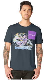
Amazon Merch Invitation About three weeks ago, I was surprised to receive an e.mail from Amazon inviting me to join Merch. Surprised, because it was at least two months since I applied and I had almost forgotten about it. For those of you who are unfamiliar with Amazon Merch, it is a relatively new addition to Amazon, where the Artist / Designer can upload their T-Shirt designs to be sold directly by Amazon and then receive a royalty for all T-Shirts sold. It is by invitation only, so you need to express your interest via their website and then wait. Once accepted you need to upload your first design within 21 days in order for your account to remain active. I have had a Redbubble account selling my artworks on a variety of products for some time. However I haven't used it in the past to it's full potential. Receiving the Amazon Merch invite has spured me on to tidy up my Redbubble products and add new catergories and artworks.  I have used photoshop to work on

Beginners - Basic Colour Theory

Image
" I came across this worksheet whilst tidying my computer today and thought it may be of use to those of you who are new to painting and drawing. It gives a brief outline of basic colour theory. You may wish to read my earlier blog posts on colour theory and my thoughts on colour and it's subjectivity ." Basic Colour Theory Primary colours – Red, Yellow & Blue (These are the three naturally occurring colours that can't be produced from mixing other colours) Secondary colours – Orange, Violet & Green (These are produced by adding two of the primary colours together)   Tints & Tones – Tints and Tones are made by adding either White or Black to your colour. i.e. By adding white to red you produce the tint of pink and by adding black you produce the tone of burgundy. With oil and acrylic paint, you achieve this by mixing the paint on your palette. With watercolour paint you use the white of the paper, so you would add mor

Tips on drawing horses - Video to accompany previous post

Image

Tips on drawing horses

Image
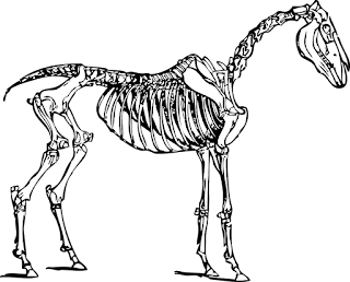
Drawing animals (horses) (Notes from recent workshop on drawing horses, that you may find useful) When we are learning to draw people, there are several basic rules that we can apply. Although there are exceptions to every rule, we learn tips on proportion that we can use in all our figure drawing. With animals, we can't have these quick tips on drawing their proportions, as all species are so different. The subject is simply too vast. Even within species, the breeds can be completely different. i.e. One rule couldn't apply to both a thoroughbred racehorse and a miniature Shetland! So we need to devise ways of making sure our proportions are accurate. As many animals have a thick covering of hair or fur, we need to begin by thinking about where the skeleton lies beneath. By knowing where the bones are, especially the skull and eye sockets, you can avoid your animal drawing looking like a cuddly toy. With a horse, pay particular attention to the leg

Starting a YouTube channel 2017 - 1000 subscribers

Image
Video to accompany my earlier blog on starting a YouTube channel.

Beginners Drawing & Painting - Shadows

Image
This blog available as PDF to download free at www.callylawson.co.uk

Beginners watercolour - Mixing skin tones

Image
Like drawing people and portraits, choosing the right colours for skin tones can be daunting for beginners. However it need not be. As I have said in previous posts on colour, it is important to develop your own palette of colours as we all see colours differently and have our own favourites. In the YouTube video linked at the end of this post, I go through a few colour combinations to get you started. Build on this by spending some time making your own mixes from the colours you already have and making a colour chart with notes of the colours used.  I begin with a mix of Yellow Ochre and a small touch of Permanent Alizarin Crimson, altering the amounts to either more yellow or more pink for different areas. I would advise that you start by having mixes of just two colours, or three at the very most. The other colours used in the video are Raw Umber, Burnt Sienna, Burnt Umber, French Ultramarine, Cobolt Blue, Cadmium Yellow and Cadmium Orange. For the shadows I use

Art fairs and trails,..... hard work but worth it!

Image
This week I have been preparing for the Silverdale & Arnside annual Art & Craft Trail. This is one of a handful of fairs, trails, open studios and exhibitions that I enjoy participating in over the Summer months. I often ask myself, is it worth all the hard work ? As those of you who also exhibit in this way will know, it is definitely hard work. Fretting over new work, worrying that everything is priced and presented well, doubting the quality of your work, deciding how much to take and that's before you load the car! Then there is the physical work of packing and unpacking the car, lugging heavy items around on hot or rainy days and putting up staging. When that is finally complete and you are pleased that your stand looks passable, you would think you could then relax. But no, after the early morning start and all the rushing around, as soon as you get the time to think you start worrying all over again. Did I leave something at home? Will any visitors arrive? Will t

Simple composition for beginners

Image
Available to download free as PDF here

Growing a YouTube channel.

Image
My first 1000 subscribers & my tips on growing your YouTube channel Back in October I wrote a blog on starting my YouTube channel and how rewarding I was finding it. Now I have reached over 1000 subscribers and thought it a good time to revisit this topic. As I said in my previous post, if you are thinking about starting your own channel then you should jump in and give it a go. For those of you just starting, these are my top 10 tips for growing your channel :- 1. Be patient!....having a YouTube channel is not a "get rich quick" scheme, like any other business it takes time to build. Don't be disheartened by slow growth to begin with, keep working on it and set yourself goals for each year. 2. Create content that you enjoy and interests you....this may seem blatantly obvious, but if you aren't 100% engaged in your content, why should viewers be? 3. Create the best videos you can with the equipment you have available, this could be a

Beginners drawing - Tones & shading

Image
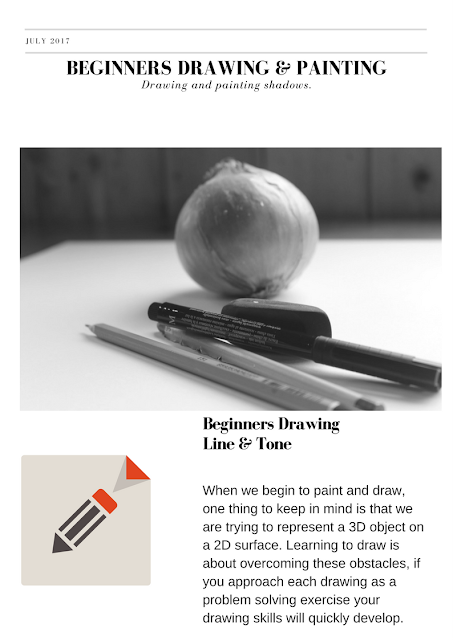
Tone This refers to the lightness or darkness of something. This could be a shade or how dark or light a colour appears. Tones are created by the way light falls on a 3D object. The parts of the object on which the light is strongest are called highlights and the darker areas are called shadows . There will be a range of tones in between the highlights and shadows, these are referred to as mid-tones. Shading Shading is used to capture these different tones in a drawing. It helps to create an illusion of form in a 2D artwork. When shading it's important to think about the direction of the marks you are making as this can help to emphasise the form of the object. Contrast Contrast means the amount of difference between the lightest and darkest tones. It should be combined with a range of mid tones. Contrast in tones can help create a dramatic artwork. Study the objects you are drawing carefully to see where the lightest and darkest tones are. Remember tha

Faber - Castell PITT artist pens review

Image
Trying out Faber Castell Artist Pens for the first time :- I recently bought the pack of 8 Artist PITT pens in black by Faber Castell. I haven't used them before, so thought I would write a quick review of them. When they arrived, I decided to use the XS pen to draw this derelict barn. I enjoyed drawing with this pen, however for size XS, I did expect it to be slightly finer. I will look to see if there is a smaller size. I used the XS for most of this drawing, apart from the shadow inside the barn which was filled in using the soft brush pen. I liked the variety of line achieved with this pen by varying the angle and pressure. In my second picture I used the soft brush pen to draw an acorn and painted in the colour with watercolour. The pens are both waterproof and lightfast with a very high permanence. Using this pen was very much like painting with a brush, I was impressed with the softness and the variety of line from this one pen. Overall I enjoyed u

Water mixable oil paint review - beginners painting tutorial

Image

Water mixable oil paints review

Image
"What's not to like about water mixable oil paints?" Water mixable oil paints have become increasingly popular over the last few years since their development. Many people used to working with traditional oils remain sceptical, especially as we learn from an early age that "water and oil don't mix"! However, leaving the chemistry aside, these paints definitely do mix with water. For me, I had two reasons for trying them out. Firstly I have a touch of asthma which I believe was being worsened by the solvents used in traditional oils. Secondly, I invite people into my studio to see my work and didn't like having the permanent smell of solvents around.  Now I have been using them for some time, I won't be changing back. As well as no toxins and smells, they are relatively mess free as brushes are so easy to clean. I clean my brushes by rinsing them and then leaving them in baby oil overnight before rinsing them again.  Some people mista

Completing your artwork - "Is it finished?"

Image
" Art is never finished, only abandoned” Leonardo da Vinci Although I agree with this concept, I do think we need to know when to “abandon” our artworks and call them “finished”. I myself am often guilty of overworking paintings. I can become carried away by the process and don't stand back from my work when I should. This can result in too much detail, loosing the sense of spontaneity and expression. There are three things I use to help me decide when a painting is “complete” :- Firstly, I was once given this advice.... “ When you think your work is NEARLY finished, then it is most probably finished ” … This advice is invaluable, when you think your work is looking good and nearly finished LEAVE it to one side for a day or so. When you go back to it with fresh eyes, you will see it quite differently. You may immediately like what you see and confirm to leave it “finished”, or see an area that needs more work or correction. Secondly, take p