Beginners - Basic Colour Theory
"I came across this worksheet whilst tidying my computer today and thought it may be of use to those of you who are new to painting and drawing. It gives a brief outline of basic colour theory. You may wish to read my earlier blog posts on colour theory and my thoughts on colour and it's subjectivity."
Basic
Colour Theory
Primary
colours – Red, Yellow &
Blue
(These are the three naturally occurring colours that
can't be produced from mixing other colours)
Secondary
colours – Orange, Violet &
Green
(These are produced by adding two of the primary colours
together)

Tints
& Tones – Tints and Tones
are made by adding either White or Black to your colour. i.e. By
adding white to red you produce the tint of pink and by adding black
you produce the tone of burgundy.
With oil and acrylic paint, you
achieve this by mixing the paint on your palette. With watercolour
paint you use the white of the paper, so you would add more water to
red paint to make it transparent and appear pink.
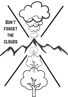
Colour
& Distance – Some colours
appear further away, whilst others jump out at the viewer. Blues
recede, whilst yellows comes forward.
When painting landscapes put
more blue in your greens in the distance and increase the yellows in
the foreground to give depth.
Colour
& Emotion – We associate
some colours with different emotions, i.e. Red for danger, passion or
love. Blue for calm and Yellow for Sunshine and joy. Consider this
when composing your picture.
Colour
& Light – Colours appear
differently in different light. Take time to observe garden flowers
at different times of the day and see how dramatically the colour
changes.
Grey
– You can produce a wide
variety of greys by combining different amounts of the three primary
colours. Experiment and keep a note of your favourites. Adding more
blue is good for skies, limestone walls etc. whilst adding more red &
yellow produces some nice browns for trees etc.
Tips:
-
Don't forget, we all see
colour slightly differently and have our favourites. It is good to
make notes of what works for you and develop your own unique palette.
To begin with choose a
limited palette containing the three primaries.
The colours I use most often
are French Ultramarine, Cobalt Blue, Light Red, Raw Sienna, Cadmium
Yellow & Burnt Sienna.
When choosing colours think
about the subjects you will be painting most often, the earth colours
are good for landscapes but may not be as suited to portraits or
garden flowers etc.
To create drama in your
painting use colours that are directly opposite each other on the
colour wheel. To produce a calmer painting choose colours that lie
side by side or tints & tones of the same colour.
.png)
Comments
Post a Comment